
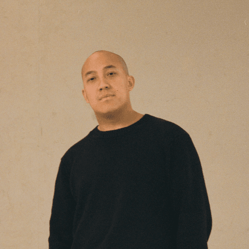
Peter Tran
CEO

A live catalogue of the building blocks in src/components/haralt. IDs follow the design handover; on conflict the newest section wins (m over n over k).
haralt/LockerMap.tsxRadius 26, height min(520px, 70vw), lazy-loaded. Markers: 34 px green circle for lockers, 40 px yellow with the symbol for the main warehouse, 3 px white edge. Legend pills bottom left. Fallback when tiles fail: “The map didn't load” + “Try again” / “Show as list”.
haralt/ErrorBox.tsxRed is only used here. Placed right above the button it concerns. Text = what happened + what did not happen + at least one way out as a link.
haralt/toast.tsx · ui/sonner.tsxDark pill bottom centre, 2.8 s, a new toast replaces the last. Only for actions without their own screen – never for anything the user must read carefully.
haralt/Modal.tsx · ui/dialog.tsxInk overlay at 55 %, click outside closes. Card min(460px, 92vw), radius 26, padding 30. Filled red primary only when the action is actually available; a block is shown as an error box with a way out.
haralt/EmptyState.tsxNever a dead end: 56 px “?” circle, title with the search term in quotes, one secondary + one primary action.
But we can get most things. Tell us what you need and when, and we'll reply within 48 hours.
haralt/StatusBanner.tsx · haralt/PriceBox.tsxConfirmation = full-width green banner with a timestamp eyebrow and a personal title. Receipt: white card max 520 with a price box.
haralt/StatusLabel.tsxGreen = active/available (dot only on “ongoing”), amber + clock = waiting on someone, red = declined/error, grey = done. Brand yellow = delivery method, not state. Fact labels follow the status label.
haralt/PillBar.tsxWhite pill bar, 4 px padding. Active = ink with white text (stays black on hover), inactive hover = cream. Same pattern for the menu, Map/List and NO/EN.
haralt/Field.tsx · ui/input.tsxNo border: cream 96 %, radius 14. Focus = 1.5 px green + white. Error = 1.5 px red. Disabled = same fill, muted text. The placeholder is always an example.
Hi! My name is and you can reach me at .
haralt/Chip.tsxSelected = ink/white. Unselected = cream 96 %, hover 92 %. Green is no longer “selected”. White chips are suggestions under the search field.
haralt/IconRow.tsx38 px icon box radius 12, Lucide 18 px, title 14/700, subtitle 12.5. Always three points. Dark card: yellow eyebrow, inverted icon.
haralt/SettingsCard.tsxSame skeleton for all: icon box + title 17/800 + subtitle, content, footer row with a divider – note left, action right. “Delete” is always its own card at the bottom.
haralt/StatusBanner.tsx · RadioCard.tsx · StatTile.tsxBanner: green = confirmed, dark = needs action. Always its own card, never inside a white one. Radio: selected = ink edge + 5 px ring. Stat tiles 18/900 and a 6 px progress bar.
ui/button.tsx · ui/button-link.tsxRadius 999, weight 700. Heights lg 52 · md 48 · default 44 · sm 38 · xs 32. Arrow only on step buttons. Disabled: opacity .45.
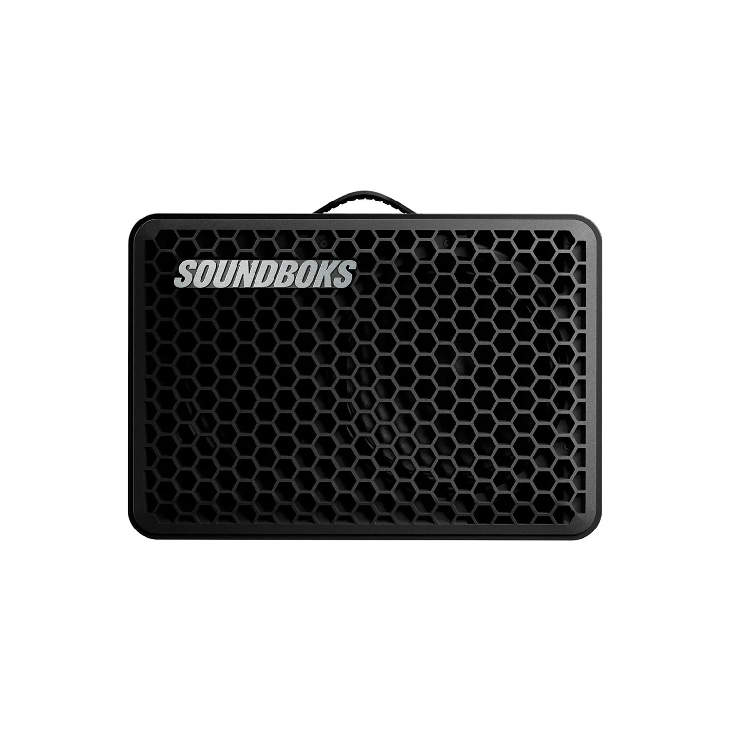
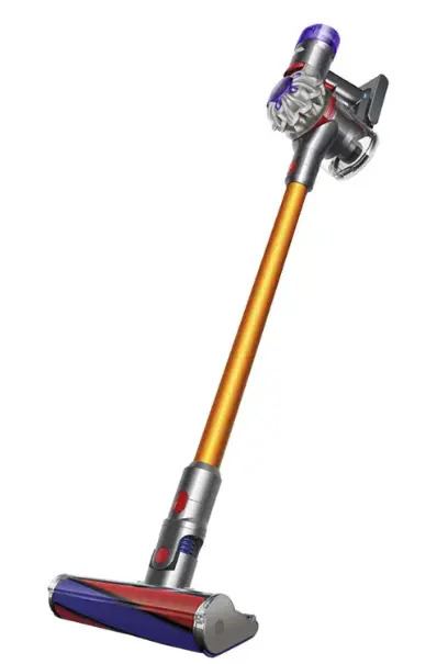
haralt/ProductTile.tsxWhite, radius 22, 1:1 image with object-fit: contain and no background. Hover: lift 2 px + shadow. The last tile in a grid is always the dashed “Missing something?”.
app/(site)/about/page.tsxTeam: 1:1 photo radius 14, name 15/800, role 12.5 muted. Value card: 24 px icon, title 16/800, text 13.5. See About.
CEO
One carpet cleaner in the locker replaces twenty in the storage rooms around it.
We check that everything works before it goes out. And we answer when you ask.
Ask, and we'll handle the rest. If we don't have it, we'll get it.